Photos by Hillary Ehlen
In West Fargo, sits an adorable two-story home that is well-loved by a family of a mom, dad and three young girls. The homeowner reached out to me, ready for a change – but wanting to stay in the great neighborhood they’ve called home for some time.
At our initial consultation, the client mentioned she had dabbled with the idea of a remodel and had reached out to Dave Anderson Construction for estimates. During our meeting, we walked through the home and talked about various ideas. We spoke about ways to use the existing cabinets by sprucing them up with paint and hardware, updating light fixtures, adding some new furniture and even some wallpaper. In this meeting I also shared my ideas on what she could do from a design standpoint – pointing out outdated cabinetry details, previous selections I’d update and “don’t think I’m crazy” type of concepts. I like to push my clients to see the potential of their homes and the potential of their personal style.
I can tell you this: after waving good-bye after the initial meeting, I thought I’d receive the call to move forward with new paint for the existing cabinets and to find a few new rugs to spruce up the place. I knew it was to be a large project if she wanted to be bold and opt for any sort of remodeling and/or ideas I had thrown out. I also thought, “We will we be keeping the spray- painted fixture.”
Then one night, I received communication from the client saying the contractor will be demoing tomorrow. Yes, tomorrow. What did this mean? She was going for it! We were going down to the studs and opening walls, headed for a main floor remodel for the kitchen, dining room, powder room and mudroom. This client was ready to be bold in her home and wasn’t afraid of adding her personal style throughout selections…from the studs up.


MAKE IT FLOW – THE EXISTING SPACES
We were off the selection races and one of the first things we needed to lock down was where would we stop – from a remodeling standpoint. If you’ve dabbled in your own projects, you know that there is a trickle-down effect with what you change. In this case, with the existing base trim and stained window and door casings in mind, we had to make the decision on if we should refresh the entire main floor, or if we should just focus on the to-the- studs remodel portion. The decision was made that we’d focus on the remodeled space, but ensuring there would still be cohesiveness throughout.
When picking colors to start with, we opted for a shade of white for the walls, casing, trim and some doors. We picked a white that would be warmer in hue to create a warmth that would flow cohesively when you walked into the other spaces that had the stained woodwork. We also opted for a nutmeg color door for the entryway and dining room space to echo other stained doors in the existing spaces. The result was a perfect blend of white and stained- tones in each space. Lastly, we refreshed the non-remodel space with the same white paint used in the remodel space to create flow that’s undeniable when in the home.
Pro Tip: Test white paints next to your existing casing or trim work to ensure the hue is a good match. Whites come in many different shades!


Classic 101
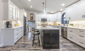
If you know the Christen Joy brand you know that I love to integrate major personality. However, I want to balance that pizzazz with classic design elements that clients can love for years and years to come. Let’s be real, building, remodeling or refreshing a space is such a treat and, at times, an expensive one. So I always want to create a space that is timeless. With that theme in mind, I recommended a white kitchen backsplash, the aforementioned white paint (however, in different sheens than the trim, doors, walls and ceiling), white oak- inspired flooring and quartz countertops with flecks of grey veining that are both durable and gorgeous. My client said she’d love to do the rainbow of colors for a backsplash (love her creativity!), and I reassured her that we’d add more than enough personality and color in the space to balance out all of the white.
Pro Tip: What’s great about a neutral foundation is you can change color schemes, easily decorate for any holiday or season and, should you be ready to sell, it’s neutral enough for anyone to come in and fall in love.


Painted & Stained Cabinetry
We wanted to provide a more functional kitchen for this client. We worked with Wendt Custom Cabinets (my go-to) and came up with the plan of a classic white, a deep navy island and a stained mudroom and drop zone. The white kept the kitchen classic in design and feeling open and fresh. The navy island was a perfect balance with the white walls and cabinets and added a bold wow-factor to the space. It was also the perfect color to pop brass tones off of. We opted for stained cabinets in the mudroom, selecting the perfect stain to play with the white oak colored flooring.
Pro Tip: Don’t fear mixing painted and stained cabinets. I, personally, like blocking the different selections in rooms to avoid a space feeling too busy.


WALLPAPER: MORE THE MERRIER
Are y’all ready to really play? This client was! After the mudroom’s white paint and a splash of blue to accompany the handsome stained cabinets, we were ready to talk paper. After locking on a board and batten wainscoting for both the bathroom and dining room, we knew we could use a bolder patterned wallpaper here, as it was balanced with the white millwork.
I’ll tell you the truth, for the dining room wallpaper I said, “I just want a client to have the courage to do it, it’s fabulous!” and she said, “well now I have to!” Movement, texture and a beautiful pastel blue as the backdrop – it’s all there. The paper is derived from Japanese woodblock printing, which is a surface print that provides a wide range of vivid colors, glazes or transparency. This pattern depicts a swirling garden with a diagonal repeat – keeping your eye moving on the paper, while avoiding a busy feeling.
The powder room is always a place you can play – be adventurous and a little, shall we say, “out there.” My client fell in love with this Birds & Butterfly wallpaper, which is inspired by a handprinted 1960s wallcovering from the archive of Schumacher, a well-known industry leader of wallcoverings. The white penny round tiles and wainscoting allow this paper to steal the show. Whimsical, playful and sure to be a favorite paper in this home.


LIGHTING (TOODLES SPRAY PAINT!)
This client has a knack for creativity and told me the tales of all the things she’s spray- painted to make work for a little longer. A for effort, but gone are the days of spray-painting fixtures! When I say she tossed the can, did she! We agreed on brass fixtures for the kitchen, over the island and in the powder room.
The kitchen is home to a globe pendant hung over the sink to create a focal point in the u-shaped kitchen. Large enough for a focal, but the clear glass allows it to be one with the space. Two lantern pendants over the island anchor this space and add a hint of femininity with the curved metal at the top.
Oversized wall sconces in the powder room flank the brass mirror and continue to layer the elements of style and boldness in this space.
Last by not least, a matte white chandelier in the dining room could be thought to be a set with the wallpaper but are actually from completely different companies. Movement, upward swirls and muted white complete the statement space.


Be Bold or Go Home
This client went for it – literally preparing for demo in 24 hours and going with her gut on selections, staying true to her knee-jerk reaction to what she loves. She left me with this: “My parting gratitude gift to you – this commemorative can of spray paint. I am giving it up – you converted me.”
So readers, now I leave you with this – a remodel may be something that you’re dreaming of, dabbling with or even starting now – just know that your only design limitations are yourself, so be bold or go home.


Sources
General Contractor: Dave Anderson Construction
Cabinetry & Countertops: Wendt Custom Cabinets
Flooring & Backsplash: Carpet World
Wallpaper: Gene’s Paint & Decorating
Dining Room Furniture: HOM Furniture
–

LIVE CHRISTEN JOY
Facebook.com/LiveChristenJoy
Instagram.com/LiveChristenJoy
Anderson is a Minnesota native with an eye for decor and design. Christen Joy specializes in new-construction commercial projects, exceptional remodels, furnishing high-end living spaces and creating memorable special events. Anderson is also a passionate art collector, world traveler and home cook who frequently entertains for friends.
Join me on Instagram and Facebook to see my latest projects and email me at [email protected] for project inquiries.
Read more from Christen Anderson here.